Hello, world!
This section of my website shows current projects; as a multi-faceted graphic designer, this may include: graphic design, photography, video, or anything in between. I update my website regularly; if you missed any of my work, you can click on the icons at the bottom of any page to see more of my work. So please take a look around; who knows what might catch your eye.
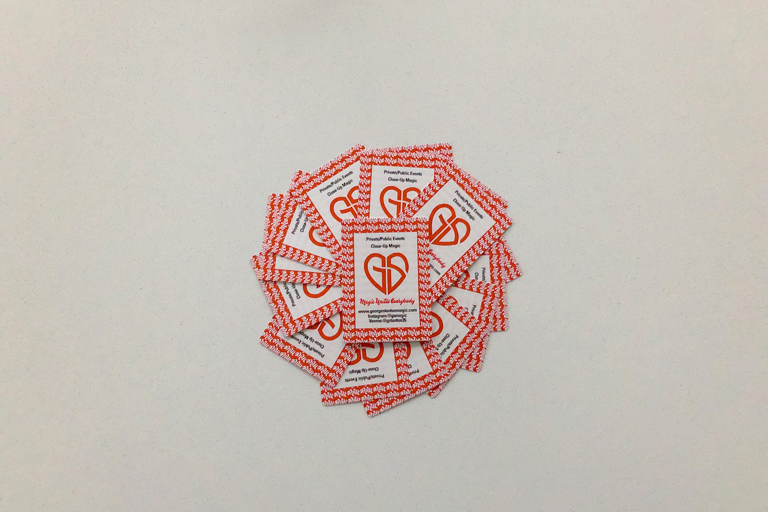
GS Logo
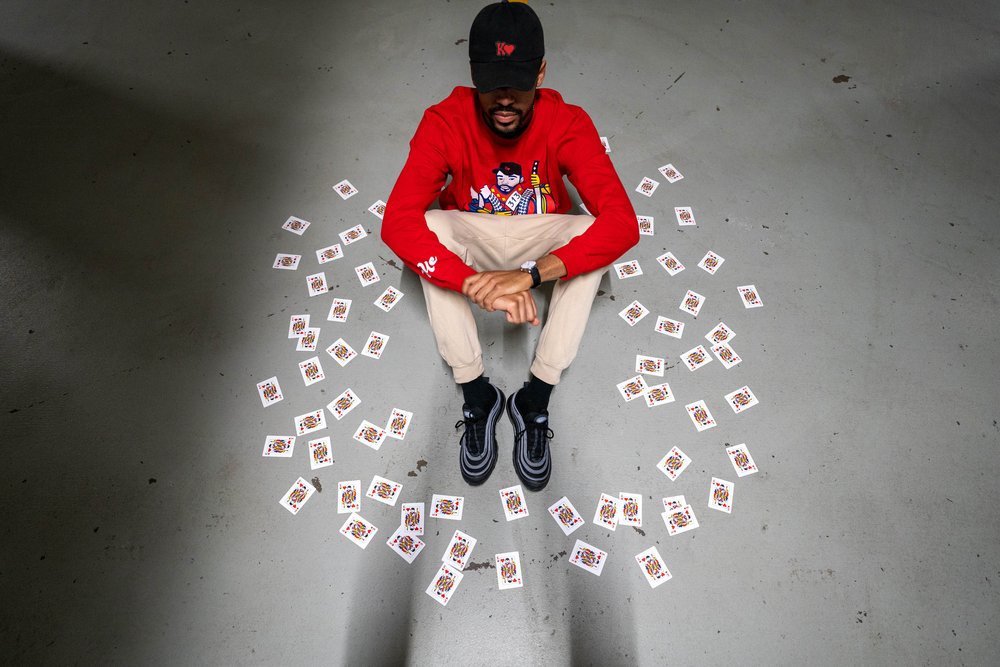
George was born and raised in Detroit, Michigan and began his magic endeavors in the 5th grade when he saw it being performed in a YouTube video for the first time. The video strongly peaked his curiosity about magic and he started to spend hours every day learning and practicing. It soon became his passion in life and he knew that he wanted to become a professional magician.
Kenneth LeDale is a Chicago rug designer. Him and George worked on a rug designed around the new logo. When asked about the new logo Kenneth states, “The new logo is iconic. There are so many different layers to the logo. Having the opportunity to spend time with you and seeing your work, the logo personifies you in every sense of the word. It represents your initials, the play-off cards, and magic. To put it simply, it is your love for magic personified. There could not have been a better logo.“
As for the design of the new GS logo, the art direction was geared towards fluidity. The GS logotype is set in a heart shape futuristic and bold sans-serif typeface, which is very similar to such fonts as Lustra Semi Bold and Bank Sans SemiCond Bold. The letters have the angles on one side sharpened, and on the other — softened, which created a unique mood and evokes a sense of motion and speed. The heart is to represent the hearts suet in the deck of cards.